Welcome Email Examples: The Structure That Actually Converts
Real welcome email examples, minus the screenshot gallery: the subject line, opening line, offer placement, and CTA structure that actually converts.

Justin Rondeau · Founding Head of Growth, Spoks
· Updated November 16, 2026
Quick answer
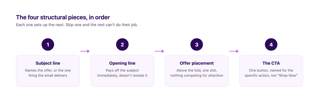
A welcome email that converts gets four things right:
- A subject line that earns the open
- An opening line that doesn't waste it
- An offer the reader doesn't have to scroll to find
- One single CTA
Three real retail welcome emails below are scored against that structure, so you can see which pieces actually hold up in practice and which ones brands get away with ignoring.
Still paying Klaviyo's monthly bill?
Spoks runs about 80% cheaper than Klaviyo for the same flows and campaigns.
Table of contents
- What a welcome email is actually worth
- Four structural pieces of a welcome email that converts
- Three real retail welcome emails, scored against this structure
- Building this inside Spoks: Looks, Components, and the block editor
- The 3-email welcome sequence, mapped to this structure
- Mistakes that break the structure before it starts
- FAQ: Welcome Email Examples
- Sources
What a welcome email is actually worth
Before getting into structure, it's worth knowing what a well-built welcome email is competing against. A 2025 ecommerce benchmark dataset puts the average automated welcome email at a 35.53% open rate, a 3.94% click rate, an 11.19% click-to-open rate, and a 2.11% conversion rate, worth $6.16 per email sent.1
For comparison, that same dataset puts automated emails overall at $3.41 in revenue per send against $0.155 for one-off campaigns, a 22x gap. Welcome sits inside that automated bucket because it fires the moment attention is highest, right after someone chose to sign up.
That 11.19% click-to-open rate is the number worth sitting with. Over a third of recipients open the email, but only about one in nine of those openers actually clicks something. The four structural pieces below exist to close that gap, not to chase a bigger open rate.
Four structural pieces of a welcome email that converts
The subject line
A welcome subject line is competing against zero context. The person doesn't remember signing up five minutes ago the way they will in a week, so cleverness buys you nothing yet. "Welcome to the family" tells a new subscriber nothing they can act on. "Here's your 15% off code" does.
Name the incentive if there's one to name. If there isn't, name the one thing the email actually delivers, a guide, a product recommendation, an invite to reply.
A subject line that promises something vague and delivers something specific trains a new subscriber to stop opening your next email. That's the fastest way to lose someone you just won.
The opening line
The opening line's job is to pay off the subject line in the first sentence, not restate it. If the subject said "Here's your 15% off code," the first line should show the code or the button to use it, not a second round of "Welcome! We're so glad you're here!" Readers skim that first line before deciding whether to keep scrolling, and a second greeting in a row just reads as padding.
Brand voice works in the opening line too, but only if it says something a generic "welcome to the family" line couldn't. One real detail, why the store exists, what's different about how the product is made, earns more trust than enthusiasm with nothing behind it.
Offer placement
A discount or incentive belongs above the fold, visible before any scrolling, with the code legible and the expiration stated as an actual date or hour, not "soon." Burying it under a hero image and two paragraphs of story is the most common reason welcome emails underperform their own subject line.
No discount to offer? That slot still needs one clear thing to look at, usually your best-selling product or whatever single item converts the most new visitors, not three or four options fighting for attention. One slot, one job.
The CTA
One button, and it should name the specific action tied to what the subject and opening line already promised. "Use your code" or "See the Weekender Bag" beats a generic "Shop Now" that could sit on any email from any store. If your platform supports linking straight to checkout with the code already applied, do that: every extra click between the email and the actual use of the offer is a chance for the subscriber to get distracted and never come back.
A second CTA competing for the same click is the fastest way to flatten your click-to-open rate, so give the reader one job. If a secondary link is worth including at all, put it visibly lower and smaller so it isn't fighting the primary button. Braze's own welcome-email research puts it plainly: "each email should have one job, or you risk giving your customers decision paralysis."2
All four pieces, put together
Here's what those four pieces look like combined into one email, the kind you'd build as email 1 of the sequence:
Subject: Here's your 15% off code
Hi Jordan, welcome. Your code's below, good for the next 48 hours.
Code: WELCOME15
Use your code →
Nothing in that email is abstract. The subject names the offer, the opening line shows the code instead of re-welcoming the reader, the discount sits above everything else, and there's exactly one button.
Three real retail welcome emails, scored against this structure
Rules are easier to agree with than to spot a violation of in the wild. Here are three real welcome emails, pulled from the retail collection on Really Good Emails, scored against the same four pieces above.3
Cette: names the offer, but the email never stops
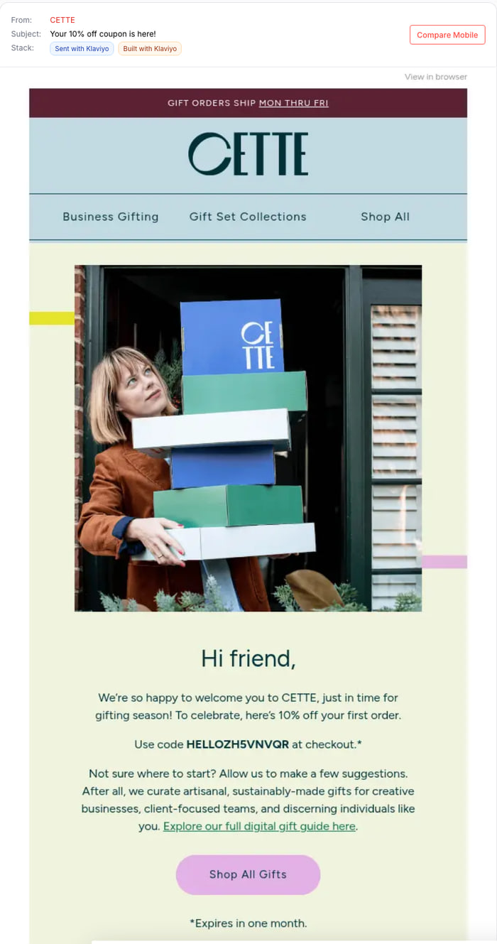
Subject: "Your 10% off coupon is here!"
| Piece | Verdict |
|---|---|
| Subject line | Names the exact offer. The only one of these three where the subject makes a specific promise the email actually keeps. |
| Opening line | "Hi friend, we're so happy to welcome you to CETTE... here's 10% off your first order." Still opens with a "welcome" beat before the offer, the same padding habit HighKey falls into, just compressed into one paragraph instead of two. |
| Offer placement | Code is bold and legible right after the hero photo. The only one of these three with a real, explicit expiration: "*Expires in one month." |
| CTA | "Shop All Gifts," repeated again at the bottom of a long product showcase further down. Not a second competing offer, just the same button twice in an email that keeps going well past the point where the welcome offer was delivered. |
The subject line here is the strongest of the three, proof the "name the offer" rule isn't just theoretical. The trade-off shows up after the offer, though: the email keeps going into gift categories and repeats the same CTA a second time, which dilutes the one-job, one-click focus the structure above asks for.
HighKey: a clean offer, buried one scroll too late
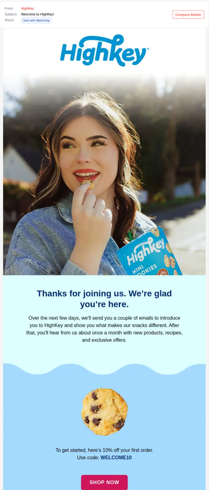
Subject: "Welcome to HighKey!"
| Piece | Verdict |
|---|---|
| Subject line | Names the brand, not the 10% off code waiting inside. |
| Opening line | "Thanks for joining us. We're glad you're here." The exact "so glad you're here" pattern the structure above calls out as padding, repeated before the offer appears. |
| Offer placement | Close to ideal once you reach it: one product shot, one line naming the discount, the code in bold. The problem is how far down: a full-bleed photo and a two-sentence block sit between the subject's promise and the offer. |
| CTA | One button, "Shop Now." Generic, but uncontested. |
Three of the four pieces land once you scroll far enough. The gap is exactly what the structure above warns about: a vague subject line with a buried payoff.
Bed Bath & Beyond: the strongest execution of the three
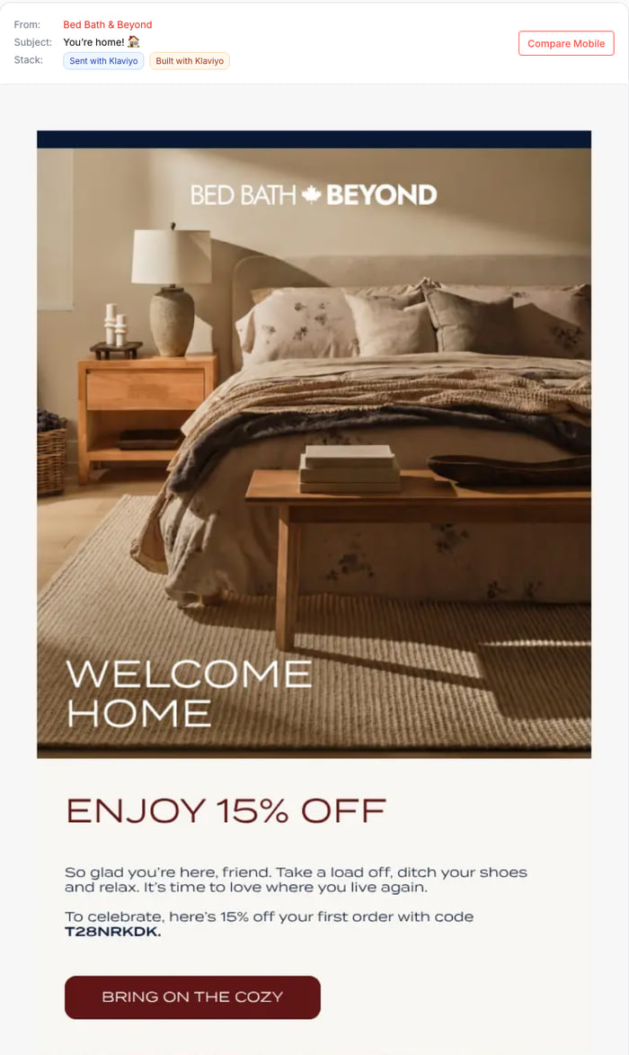
Subject: "You're home! 🏠"
| Piece | Verdict |
|---|---|
| Subject line | Doesn't name the 15% off, but it's specific to this one email's theme rather than a generic greeting, and it pays off in the very next thing the reader sees. |
| Opening line | "So glad you're here, friend. Take a load off, ditch your shoes and relax." Two short sentences of brand voice, then straight into the code. No second "welcome" layered on top. |
| Offer placement | "Enjoy 15% off" sits directly beneath the hero image. No second section, no story paragraph first. Code is bold and legible. |
| CTA | One button, "Bring on the cozy," written to the brand's own theme instead of a generic "Shop Now." |
The closest of the three to the structure above, with one deliberate trade: it spends its subject line on voice instead of naming the discount. That only works because the payoff is immediate, which is exactly why a vague subject line is a much bigger risk once the reader has to scroll to find out what it meant. HighKey is proof of that.
The pattern across all three: Cette is the only one that names its discount in the subject line, and the only one with a real stated expiration, so both rules hold up in the wild, not just on paper. The other two split differently: Bed Bath & Beyond gets away with a vague subject line because it delivers the offer immediately, while HighKey's vague subject line actually costs it, since the reader has to scroll past a full section before the payoff shows up. Cette's own weak spot isn't the subject or the offer at all. It's that the email just doesn't stop once the job is done.
See it before you switch
Get Started and copy your flows, templates, and contacts from Klaviyo in minutes.
Building this inside Spoks: Looks, Components, and the block editor
Everything above is a set of rules. Here's how to actually build it, using the real mechanics in Spoks' email marketing editor rather than a generic "use any email tool" wave of the hand.
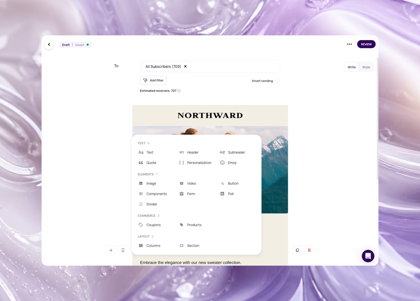
Set your brand's fonts, colors, header, and footer once as a Look. From there, the block menu maps directly to the four pieces above:
- Header block for the opening line
- Coupon block for the offer, not a code pasted into plain text, so the discount and expiration render consistently
- Button block for the CTA
Save email 1's header, footer, and button as reusable Components so email 2 and 3 start with those pieces already in place, leaving only the subject line, opening line, and offer slot to write fresh each time.
Spoks' flow library ships a Welcome Flow template under its Essential tag, so the trigger and the three-step skeleton don't start from a blank canvas. The stock content inside those three steps does need rewriting, though: as published, it's a generic "thank you for signing up" email, a "follow us on social media" email with three equal-weight buttons (Facebook, Instagram, TikTok), and a bestsellers showcase, with no discount code anywhere and three competing CTAs in the second step alone.
Keep the trigger and the step count. Cut the social-follow step's extra two buttons down to one, or drop the step entirely if there's no offer behind it, then rewrite each send's subject line, opening line, and CTA to match the structure above. The default delays also run longer than the sequence below recommends, 3 days before email 2 and a further 4 before email 3, so shorten both if speed is the point of sending a welcome series at all.
The 3-email welcome sequence, mapped to this structure
Our Shopify email marketing guide covers the full timing and reasoning behind a three-email welcome sequence in more depth. What's worth adding here is where sequences usually fall apart: email 1 nails the structure and email 2 quietly drops it, reverting to a vague subject line and a CTA that just says "Shop Now" again.
Here's how the same four pieces should shift across the three sends:
| Subject line's job | Opening line's job | Offer placement | CTA | |
|---|---|---|---|---|
| 1 (sent within minutes) | Name the offer literally | Pay off the subject in sentence one | Above the fold, code visible, no scrolling | One button, offer already applied |
| 2 (24 to 48 hours later) | Signal new content, not a repeat of email 1 | One real, specific detail about the brand | Secondary, supports the story rather than leading it | Button points at a specific product, not the homepage |
| 3 (72 to 96 hours later) | State the deadline plainly | Restate the expiration, no suspense | Discount reinforced with an exact expiration time | Button text matches the actual deadline language |
Treat that table as the checklist to run each draft against before it ships, not just email 1. If you're starting from Spoks' Welcome Flow template, this is also the target to edit toward, since its default timing and content don't match this table out of the box.
Mistakes that break the structure before it starts
A few things quietly undo all four pieces above, even when each one looks fine on its own.
Sending the welcome email hours after signup instead of minutes is the most common one. By the time it lands, the subscriber has moved on, and the "here's your offer" subject line reads as an afterthought instead of a reward for just signing up.
Reusing the identical subject line structure for all three emails in the sequence is a close second. A reader who sees the same pattern three times in three days starts pattern-matching it as a template before they even open it, and that drags down the open rate for emails 2 and 3 no matter what's actually inside.
Too similar (reads as the same email three times):
- Email 1: "Here's your 15% off code"
- Email 2: "Here's your 15% off code, reminder"
- Email 3: "Here's your 15% off code, last chance"
Varied (reads as three different messages):
- Email 1: "Here's your 15% off code"
- Email 2: "The story behind [Brand]"
- Email 3: "Your code expires tonight"
The opening line and the offer slot saying the same thing twice wastes a sentence the reader didn't need. If the subject line already named the discount, restating "Welcome! Here's your discount!" before showing the actual code adds nothing new.
Two CTAs with equal visual weight in the same email cost just as much: one of them wins the click, and the other becomes dead weight that adds scrolling without adding conversion.
And check the email on a phone before it sends. An offer that sits "above the fold" on a wide desktop preview can land two full scrolls down once the same layout renders on a 6-inch screen, which quietly undoes the entire offer-placement rule above for most of your list.
FAQ: Welcome Email Examples
Where are the actual welcome email examples with screenshots?
Three real retail welcome emails (Cette, HighKey, and Bed Bath & Beyond) are scored against the four-piece structure above. The scoring, not the screenshot, is the transferable part: copying a competitor's layout without knowing why one piece works and another doesn't rarely survives the swap to your own brand, product, and offer.
Should the first welcome email include a discount code?
If you've promised one to get the signup, yes, and it should sit above the fold with the code legible and no scrolling required to see it. If there's no discount involved in your signup flow, that slot still needs one clear thing to look at, usually your best-selling product, rather than several competing options.
What's a good open rate for a welcome email?
A 2025 ecommerce benchmark dataset puts the average automated welcome email at a 35.53% open rate and an 11.19% click-to-open rate. Click-to-open is the more useful number to track, since it isn't skewed by Apple's Mail Privacy Protection the way raw opens can be, and it tells you whether the structure of the email, not just the subject line, is doing its job.
How many emails should a welcome sequence have?
Three is the common starting point: one sent within minutes that delivers the offer, one 24 to 48 hours later that builds trust with a real brand detail, and one 72 to 96 hours later that states a deadline plainly. Our Shopify email marketing guide covers the timing reasoning behind each one in more detail.
Do I need a specific tool to build the block structure described here?
Not specifically, but the structure described here (Header and Personalization blocks for the opening, a dedicated Coupon block for the offer, a Button block for the CTA, saved as reusable Components across the sequence) maps directly to Spoks' email editor if that's what you're using. Any block-based editor that separates these element types the same way will let you build the same structure.
Why does email 2 of a welcome sequence usually underperform email 1?
Usually because it quietly abandons the structure that made email 1 work: the subject line reverts to something vague, the opening line repeats a greeting instead of delivering a new detail, and the CTA goes back to a generic "Shop Now." Running each draft against the same four-piece checklist used for email 1 is the fix, not writing a longer email 2.
Sources
Sources
Footnotes
-
Omnisend, "Email Marketing Benchmarks: What Good Looks Like in 2026" (omnisend.com/blog/email-marketing-benchmarks), published May 12, 2026, drawing on a 2025 ecommerce dataset. Welcome automation figures cited: 35.53% open rate, 3.94% click rate, 11.19% click-to-open rate, 2.11% conversion rate, $6.16 revenue per email. Verified via direct fetch, November 18, 2026. ↩
-
Braze, "Welcome Email Examples: Best Practices & Personalization" (braze.com/resources/articles/best-welcome-campaigns). Cited: "each email should have one job, or you risk giving your customers decision paralysis," and a starting point of roughly four emails or fewer for a welcome series. Verified via direct fetch, November 18, 2026. ↩
-
Cette, Bed Bath & Beyond, and HighKey welcome emails, as archived on Really Good Emails (reallygoodemails.com/categories/welcome). Verified via direct fetch, November 18, 2026. ↩